CTA funnel clarity, from first click to enquiry.
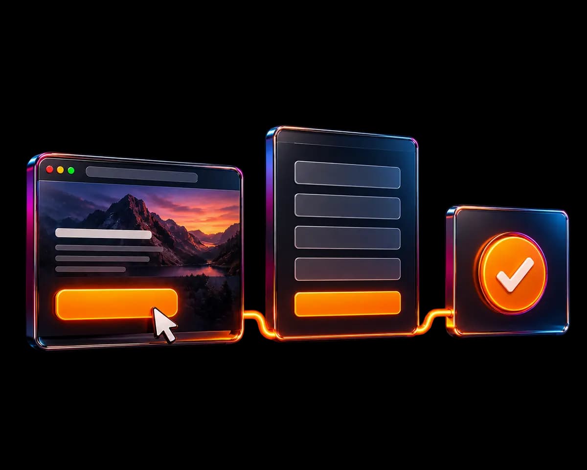
Give visitors one clear invitation, a focused form, and a useful confirmation. The experience after the click matters.
01
Choose the action that fits the buyer's stage
A visitor who is still diagnosing the problem may not be ready for a sales call. A focused review request can be a more natural starting point. Someone who already understands the scope may be ready to discuss implementation. The primary CTA should match the job of the page.
Keep one primary destination for the same offer. Repeating a review button further down a long page can be useful; sending those buttons to different forms, email, direct messages, and booking tools creates an inconsistent expectation. Secondary resources can remain available without competing visually with the main action.
A clearer message, in practice
- Vague
- Get started
- More specific
- Request my free review
Use specific wording only when the linked page really offers that action. Clarity comes from the destination as well as the label.
03
Make the form and confirmation part of the same promise
Ask for information you will actually use to review or qualify the request. Contact details, profile and website links, the main problem, and implementation context can be useful. Remove questions that have no role in your next decision; a longer application needs a clear reason for each field.
Use visible labels, understandable options, and specific validation messages. Preserve the visitor's answers if a submission fails. On mobile, check that dropdowns and error messages stay visible and that the submit button remains reachable. Do not collect confidential client information in an initial enquiry.
04
Continue the promise after the form is complete
Only show success after the server accepts the application. The confirmation page should acknowledge receipt, explain the next step, and offer an optional conversation where appropriate. A notification email can support that process, but a failed notification should not silently erase a request that was already saved.
Tell the visitor how you will respond and what to expect from the review. Only publish a response time you can meet. Keep the follow-up relevant to their request; an enquiry is not automatic permission to add someone to a marketing newsletter.
If a clarity call is optional, offer it after confirmation and make that choice explicit. The visitor should not need to complete another mandatory step to make the original application count.
The confirmation and follow-up should feel like the continuation of the request, not a new sales funnel with a different promise.
05
Track the complete path without collecting unnecessary personal data
Start with a simple sequence: landing-page view, primary CTA click, accepted form submission, and optional booking. Use stable event names and the page or button location to understand where visitors act. Do not send names, email addresses, profile URLs, or free-text answers to Google Analytics.
Keep submission records in your secured database. Analytics events help explain behavior, but they are not a substitute for the actual application record. Ad blockers, consent choices, and repeated visits can make analytics totals different from the number of leads you receive.
If many visitors click but few complete the form, inspect the form before changing the headline again. If the form completes but enquiries are unsuitable, review qualification and offer wording. Use the stage that is underperforming to decide what to improve next.
Test the complete journey after every meaningful change, including validation, successful submission, confirmation, and notification handling.
Common questions
Can I keep email and social links alongside my main CTA?
Yes. Keep them available as supporting contact options, for example in the footer or Contact page. The same review offer should still have one clear primary application path.
Should the thank-you page force a Calendly booking?
Not when the promise is an application or review request. Confirm the request first, then offer a call as an optional next step. That keeps the original action clear and lets interested visitors continue.
Apply it to your own business
Where is your visitor journey losing clarity?
Share your LinkedIn profile and website for a focused review. One application, one clear next step. No pressure.
Continue the journey
All resources
LinkedIn positioning
LinkedIn Profile Optimization
A practical LinkedIn profile optimization guide: align your headline, banner, About section, Featured links, and website CTA for clearer enquiries.
Explore resource
Website strategy
Website Conversion Strategy
Build a clearer website conversion strategy for LinkedIn visitors with message matching, offer clarity, credible evidence, mobile usability, and a focused CTA.
Explore resource