Website conversion strategy for warm LinkedIn visitors.
LinkedIn creates interest. Help visitors understand your offer, trust your approach, and take one confident next step.
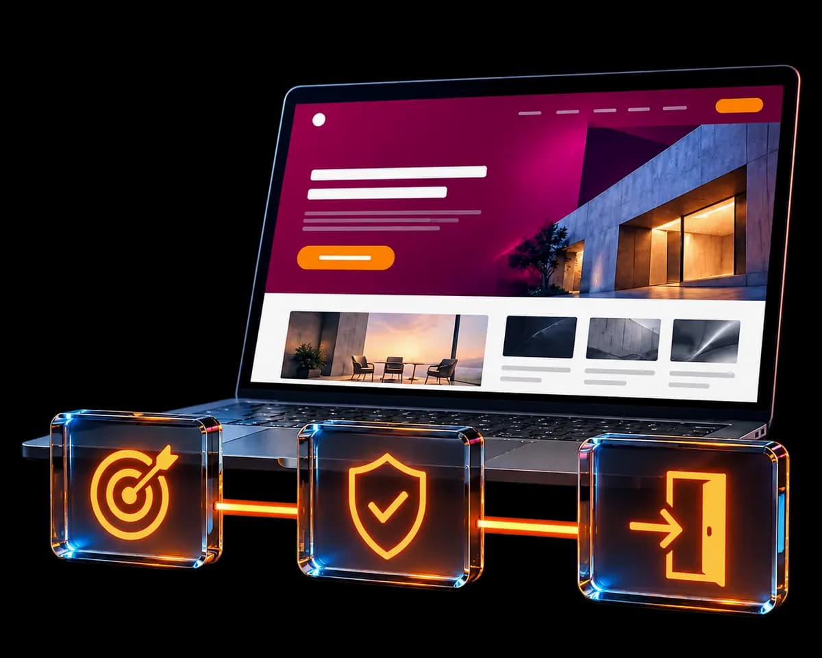
01
Continue the promise that brought the visitor here
A visitor arriving from LinkedIn is not starting from zero. They may have read a post, scanned a profile, or clicked an offer in the Featured section. Your opening section should confirm that they reached the right place instead of making them decode a new positioning statement.
Make the audience, problem, and service visible near the top. If your profile talks about improving enquiries, a heading about beautiful digital experiences can feel disconnected. Good design supports the commercial message; it does not have to replace it with abstract language.
A clearer message, in practice
- Vague
- We create innovative digital experiences for ambitious brands.
- More specific
- A clearer website enquiry path for service businesses already attracting attention on LinkedIn.
A message-matching example. The right wording depends on your actual audience and service.
02
Build the page around the buyer's questions
Page length is not the first decision. Decide which questions must be answered for this particular offer, then give each section one job. Keep the main path concise and link to deeper resources for readers who need them.
Relevance: is this for me?
Identify the audience and recognizable problem. Explain the outcome without promising a result you cannot control.
Offer: what am I buying?
Describe the service, expected process, starting investment where appropriate, and important scope boundaries.
Confidence: why this approach?
Use genuine work, a labeled sample, or a visible explanation of your decisions. Evidence should be close to the claim it supports.
Action: what happens next?
Explain the review or enquiry step, what information is needed, and what the visitor can expect afterward.
Remove repeated explanations before removing useful detail. A focused page can still answer serious buying questions.
03
Make your evidence inspectable and specific
A claim such as conversion-focused is difficult to evaluate on its own. A before-and-after message, an annotated page, or a clear walkthrough gives the visitor something they can inspect. Explain the business context and the decisions you made rather than relying on visual polish alone.
Keep sample audits separate from client results. State whether an example is independent analysis, your own website, or paid client work. If you do not have measured outcomes, explain the improvement in the journey without attaching an invented percentage to it.
Place evidence where it resolves uncertainty. A relevant example next to the service explanation may be more useful than a large portfolio at the bottom of the page. Link to the detailed work for visitors who want to examine it further.
04
Check the mobile journey and measure useful actions
Open the page on a narrow screen and follow the same path a prospect would take. Check that the offer is understandable, the main button is easy to reach, text does not spill outside its container, and the form works with the on-screen keyboard. Important content should not depend on a hover effect.
Reserve space for images, keep essential text visible before animation, and avoid loading decorative effects before the message. A visually impressive page is not useful if the visitor waits for the offer to appear or loses their place when media loads.
Measure the stages separately: relevant landing-page visits, main CTA clicks, successful form submissions, and qualified conversations. A click is not a completed enquiry. Treat your saved applications as the operational record, and analytics as a way to understand patterns; consent settings and blockers can affect analytics totals.
Change one meaningful part of the journey at a time and compare similar traffic sources. Low-volume data is a clue, not proof of a guaranteed lift.
Common questions
Do I need to rebuild my website to improve conversions?
Not necessarily. Start with the weakest part of the journey: the message, service explanation, evidence, CTA, or form. Improving an existing page may be enough when the underlying site is usable and reliable.
Should a LinkedIn landing page be shorter than my homepage?
It can be, especially when it serves one offer. A focused review page can collect an application while the homepage provides a broader introduction. Shorter is useful when it reduces repeated decisions, not when it hides essential information.
Apply it to your own business
Where is your visitor journey losing clarity?
Share your LinkedIn profile and website for a focused review. One application, one clear next step. No pressure.
Continue the journey
All resources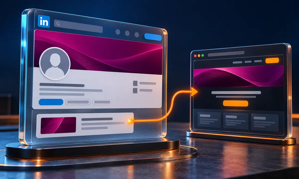
LinkedIn positioning
LinkedIn Profile Optimization
A practical LinkedIn profile optimization guide: align your headline, banner, About section, Featured links, and website CTA for clearer enquiries.
Explore resource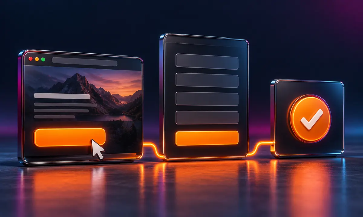
CTA and enquiry flow
CTA Funnel Clarity
Improve CTA funnel clarity with specific button copy, a focused intake form, useful confirmation, optional booking, and meaningful conversion tracking.
Explore resource